Monday 6 May 2013

Contents Page


The blog starts at the bottom, the earliest date is the bottom of the page.
You can also view each blog post by the blog archive on the right.

Introduction: September 2012

What Is A Music Video? : Septmeber 2012

Genre/Target Audience: Septmeber 2012

Music Video Theorists & Theories Reasearch: Septmeber 2012

Existing Music Video Research
Bombay Bicycle Club: Septmeber 2012
Kasabian: October 2012
Coldplay: October 2012

Ancillary Text Research
Album Advert Research- November 2012
Album Cover Research- November 2012

Planning
Planning Ancillary Texts-December 2012
Planning Music Video- December 2012

How my filming is going- January 2013

The production of my ancillary texts- March 2013

Final Products
Final Digi-Pak- March 2013
Final Album Advert- March 2013
Final Music Video- April 2013

Evaluations
Audience Feedback- April 2013
Media Technologies- April 2013
Main Product & Ancillary Texts- May 2013
Conventions- May 2013


Conventions- Evaluation

In what way does your product, use, develop or challenge forms and conventions of real media products?

The first convention I used was extended narrative. I decided to use extended narrative from one of my researched videos by Kasabian called Fire. I think my extended narrative is very good, I liked Kasabians because it made the music video interesting, it gave more narrative to the story. I feel mine has done the same, it not only sets the scene but introduces the story and song into each other. When they start playing the game RockBand the song starts, I thought this was a clever way to merge the narrative and when the song starts especially as the song lyrics and no relevance to the narrative.

My music video features the band members as the characters in the narrative. This was done by the Paradise music video and Fire music video. I felt it was important to feature the artist in the music video because they are not a well known band and need to gain popularity and become recognized. 

I decided to develop the convention stop frame animation in my music video. The music video Shuffle I researched has no narrative and only used stop frame animation to show the lyrics on screen in interesting ways. I was really inspired by this convention and I decided to develop it further by in fact reducing the amount of stop frame animation used, Instead of making a whole video out of stop frame animation I made only my titles out of stop frame animation. This was a risk to put both camera footage and animation into the same video because of how they would transition together. I felt it worked really well, It makes the titles look very interesting and realistic, I think it looks much better then if I had used your general which transition on and off screen. The titles were something my audience liked very much too.

Another convention I decided to use was the use of a costume for comical use, like in Colplay's video with the elephant costume and in Kasabians video with the cowboy western theme to the costume. I dressed my characters in nerdy outfits with nerd props like glasses, calculators, books, bowties and braces. I feel this emphasized my characters nerd stereotypes and had a big comical effect on the audience.

In Colplay's music video paradise a section of their video is live performance footage. I felt this showed the seriousness of the band as well as having their comical entertaining video. This is why I used the convention of contrived performance in my music video. I was un able to get a live performance because I couldn't find a big enough audience for it to look effective. So I settled with a contrived performance, I think it looks really good especially the shots and editing I have used give it variety and entertainment just like a real performance.  I feel by using this convention the audience feel that the band are a good band who can perform live and write their own music. I think it also advertises their music and tour, by having a contrived performance which looks good and lively people want to go to their tour.

Main product and ancillary texts- Evaluation

How effective is the combination of your main product and ancillary texts?

I think I have created three very good products which link well together and reflects the bands image. Firstly, I wanted overall to get across  the main band image which was they are a very fun and young band who are very individual and have great personalities but are also very serious about music and what they do. I feel I have got the very fun and young side across in the music video, and the more professional serious look and feel to the digi-pak and album advert. I felt it was important to keep the advert and digi-pak professional because this is what the consumer is potentially buying, you buy a CD for the good quality music you like. I felt you watch a music video more for entertainment and to see what the band have done with the music video and song together.

I decided to create a Art Deco feel to my ancillary texts, I think this is a professional style that is attractive and works with the mahogany drum artist name. The word Mahogany is very decorative just like the style Art Deco.

From my research I concluded I wanted to keep the text of the artist name "Mahogany Drum", the same in each of my texts. In the future If I was to make another ancillary text or next album I would keep the text of the artist name the same so the audience recognize it instantly for being a Mahogany Drum album. I feel I have done this effectively by choosing a unique text, keeping the same text on the album and advert has linked them together and you can clearly tell they are by the same band.

In my album cover I wanted the picture to link with the album title. I have a picture of an guitar pic frozen in a block of ice. The album name is called "Ice" so I have effectively linked the name and image together. I feel the guitar pic also represents that they are a band who play all their own music. You associate the guitar pic with artist who play instruments and perform live.

I think I have combined the album cover and the album advert particularly effectively by having the same image of the pic in the ice cube in both ancillary texts. By having the same image in both you associate them with each other, and because the advert is suppose to be advertising my album it makes sense to have the album front cover image in the advert so the potential consumers know what it looks like.

In my research I decided to not to put an image of my artist on the album cover, the artist imagery features in my music video and on my album cover. I felt these were the best places to have the image of the artists. I felt the album cover is too small to have an artist image, I wanted to keep the album cover simple and not full up or busy. I think having an artist image on two of my three products works well and promotes their faces enough for them to become recognized by fans.

On reflection I am glad I went with the Art Deco more serious album advert then the antarctic penguin advert, I think this because I believe my album cover and advert work so effectively together, to have a jokey advert wouldn't of fitted my album cover.

Monday 29 April 2013

Media technologies- Evaluation

How did you use new media technologies in the construction and research, planning and evaluation?

Through out this course I have used a wide range of media technologies. Firstly, I have used this website; Blogger.com to create a blog to present my work. I did this because I thought it required a higher skill level to use and looked more impressive then your average PowerPoint slide or Word document. I did the Microsoft PowerPoint and Word programs to collect notes and do rough drafts before typing up on my blog.


The biggest media technology I have used has to be the Internet, I have used various platforms like GoogleChrome, Firefox and Safari depending on what computer I am on. I used Google and YouTube to research existing media products. I have used the website Moodle to communicate with my teachers and submit work for marking. I have used the e-mail system called FirstClass which the school uses to keep in contact with teachers and my client. I have used the social networking sites Facebook and Twitter to advertise my music video on the band's pages and I used a hyperlink to make it easier for the fans to find the video on YouTube. I also used SoundCloud to give the band a place to promote their music and get the song on the web for fans to listen too.


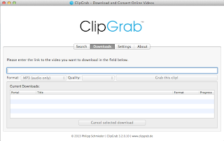
To construct the research videos I made about media theorists I used a program called ClipGrab to get the clips of the music videos. I used Garageband to record my voice over. I edited through FinalCutPro 10  then uploaded it to YouTube.


To construct my music video I used Canon camera to collect my shots. For this I needed an SD card and tri-pod. I used the stage lighting and lighting deck to create the atmosphere for a real performance on the stage.  To edit my music video and add effects I used Final Cut Pro 10 on my Apple MacBook Pro. As the band did not have their song already recorded, I recorded it for them using the software Logic Pro.

To construct my ancillary texts I used Photoshop CS6. I also used the Canon camera to get the shots for my Digi-Pak.

I used a hard drive to transport files around and back up my work during editing.


In my evaluation to make the audience feedback video I used a flip camera and edited it on Final Cut Pro 10 then uploaded it to YouTube.

Evaluation

I was happy with using mostly all the software, I came up with few errors and issues. I think I was efficient with my time because I have a vast experience already in using most of these programs. I gained a vast amount of knowledge from last year and felt I made far fewer mistakes then last years coursework.

I did however have a problem with Blogger, as this is the first time I am using Blogger I am unsure how to change the layout of how my blog posts appear. I wanted the first blog post I wrote to appear at the top, but it appeared at the bottom and every more recent blog post would go on top of it. As this is a coursework blog not a gossip blog I think it is stupid having the evaluation as the highest post, the introduction should be at the top. The only way I could get round this was to make a contents page and date archive to try to make it easier to understand.

I feel the quality of the sound I recorded on Logic Pro is quite average/poor. This was because of again my in experience with this particular program. As I am an A Level student that is using basic equipment, I was never going to achieve a high standard of a recording studio. I do think that I have a good recorded song for the equipment and opportunities that were available to me.

I think using a wide variety of programes and different technologies has been a great bonus to the quality of my work in producing my three products, and how I have presented my theory and research work. As this is a media course I think it is important to use media as much as possible in every aspect of my coursework which I have done.

Wednesday 24 April 2013

Final Music Video

Pathos- Music by Mahogany Drum- Produced by Jack Taylor

http://youtu.be/OXdF7yF-KqM


Friday 19 April 2013

Audience Feedback- Evaluation

 What is the importance of audience feedback?

I got some audience feedback to get posotives and negatives about my three products. I took many forms of feedback. Some interviews which I recorded, I also did a questionaire. The interviews were good for getting a bit more depth and explination to points made were as the questionaire was better for getting statistical anwsers and I could get more people to fill out a questionaire.


Interview Feedback:
  • The video was interesting, entertaining and comical.
  • The video was edited well, the cuts were used at the right time.
  • The syncing of the instrument playing was good to that of the music.
  • A unique and interesting way to present titles.
  • They liked the extended narrative start of my music video.
  • They liked the rock band narrative idea to get into the song.
  • The sound quality.
  • There could of been a crowd at the stage performance.
  • Certain sections of the main singer were not lip synced correctly.
I am pleased with the feedback that was given, I am happy with the posotives given back because it was what I target to get across to the audience. I spent a long time editing the music video to get the cuts in the right place, and I spent a lot of time planning and thinking about shots and the structure of my video so I am glad they liked that. I wanted the titles to be unique and individual to me which I feel I achieved. I said that I wanted my music video to be very entertaining and comical which is what all of the interviewies said it was.

I agree with the negatives about my music video, when I made it I had concerns about the sound quality. The reason I decided to go ahead and publish the music video on youtube and not being happy with the sound was because my band were very happy with the sound quality, we had originally recorded different vocals, but they wanted to re record them, I thought the quality of the second vocals was very poor but the band were very pleased, and I thought as my music video is representing the band I want to make them happy by producing something which is how they want their music and style to be.

I agree with maybe it would of looked better with a crowd at the stage performance, but I discussed earlier the difficulties getting a audience to attend the shooting.

I will improve the lip syncing section in which the singer walks away from the mic whilst the note is still being sung.

Friday 29 March 2013

Thursday 28 March 2013

The Production Of My Subsidairy Texts

Below are a collection of images I took as potential front covers for my Digi-pak.


 I am pleased with the shots I have, these are just a few I have chosen to show. I have various of similar shots but a change in angle or focus. I will now use these images to develop into album covers.

Below are six potential album covers I have made.


I wasn't sure which of these were the best so I decided to get some feedback. I asked some simple questions like which do you like the most? Which do you dislike the most? What would you improve on each one? I got some really good comments on sizing of text, some didnt like the degree of angle the mahogany drum was written in album two, some really liked the boldness of mahogany drum in the last two albums. Every one I spoke to did not like the text Ice, they said it was too cartooned and un realistic, it didn't fit with the picture. Every body liked the text of Mahogany drum in the last two album covers.
The overall favourites were the very last album cover with the pic in the melting ice cube, and the third album cover. They all thought this was the best because they liked the images the most.
When I asked if I was to take the last album covers on what should I change about it, They said the text of Ice isnt very good and I should do it more like how Mahogany Drum is written. I should also consider making either the colors of Mahogany drum and something else around the ice cube to make it more interesting maybe like a border. I will take into consideration the feedback I have got and will go on to develop the last album cover.

Below are the next album covers designs I made.


With these I changed the font of the text Ice to the same as the Mahogany Drum text. I also added colour to the text to make it more interesting, attractive and eye catching. To make the overall cover more interesting I used the rubber effect in a special way to create a sort of rubbed out, splash border effect. I think it looks like it has been frozen over which works with the ice cube.
I then asked for some more feedback on the latest version of my album covers. Everyone I asked like the fourth cover the most. They said the image is the best because you cant really see the ice much in the first two. It also is the easiest to read the white version over the black background version. They also said the black version looks too gothic and punk then indie rock. One point made was the white looks more like the image has been frozen over then the black background does. The only criticisms I found with the fourth album cover was they still had trouble easily reading the title and artist name due to the background.

This was the last version I did, I changed the colour of the text to an even lighter red to make it more visible and easy to read. I also changed the background directly behind the text to a white to make it easy for you to read the text. My client and target audience were very happy with this cover and I haven't found any more criticisms.

Wednesday 16 January 2013

How my planning & filming are going...

Friday 16th November

I have started to plan how my music video will start to take shape, I am coming up with many problems which I am finding ways to solve. Planning is a very complex thing which takes time, I am currently doing my storyboards. I am doing it in three steps, firstly thinking about what is in the shot and righting a rough description. By doing this I am getting a rough outline of the video. Secondly I am working out all the timings of every shot and filling in every detail like settings, props, costume etc. Finally I am looking over all the shots with the music to see if it fits and handing my story boards to my teacher to see if he thinks I need any more shots or need to change anything in the story boards. I think by doing it in these three stages I am being much more efficient and by going over my story boards lots I wont find I have any problems come shooting.

I have already come up with a few problems in my story boards like my teacher thinks I should add a few more shots and when I was thinking about my location I got the T.V in the wrong corner of the room. I have chosen to put all these problems on a notes page which I will refer to when recording and I will attatch it with my storyboards.

Monday 26th November

I am currently doing my Production Schedule, this time of month is very busy for me with the school production and I have little time to spare. I am trying to work out when I should shoot, I have choosen two suitable days for me. My next step is to check with the band if they can shoot this day, check can I use my location these days. Ask the media technician for lighting suggestions, get training and book out all the equiptment I need for each day.

Wednesday 28th November

So far I have had no problems booking out my locations and the equiptment, it looks like both these days will go ahead as planned. I have booked out the theatre for Friday 14th December. I have been to the music department and got permission for the use of the istruments. I have booked out the cameras and sound recording equipment.

Monday 3rd December

I am currently re-considering having an audience in my music video. I think it would look much better to have an audience but because I am limited to school I am struggling to get the number of people I want to make it look good. Also students get very bored easily and will be complaining and there will be a lot of stopping and starting. I am concerned if I used a real audience, would they act like a real audience? Or would it looked too contrived. I have also heard of past students music video in which only a few people turned up and it looked rubbish. All these reasons is why I am going to be using actors as an audience.

Monday 17th December

Friday 14th December was the day of my shooting. I dont think it was very productive or effecient. Everything when setting up went to plan, We transported the instruments from the music department and set them up in the hall rather quickly. I microphoned all the instruments and vocals and I set up the stage lighting plan. However trying to get the right levels for each microphone too a while, eventually we couldnt manage to get it to sound any good. I asked the technician for help and neither of us could understand why it sounded rubbish so we postponed the sound recording.

 When it came to the shot recordings I started as planned using the canon 600 deep, however somone left the battery out and it wasnt charged. After charging it for fifteen minites I tried using the camera but I couldnt get the settings right and it looked really dark and low quality, this is mainly due to I have no training and have not practised with this camera before. So I switched to the HD camera so I could atleast finish doing something productive. My conclusion of Friday, I think it went horribly. I came away with no sound recording and very little shot wise, what I did have I thought was very average. After looking at another students work I have decided to schedule another shot recording using the Canon 600 because the quality of shot was much better. This time I wont have to set up the sound equipment which should save some time, I am not going to use the shots I got last time because you will notice the difference in quality. The only positive I can take from Fridays recording is the experience.

Tuesday 4 December 2012

Planning Music Video


These are my planning documents..

Scene Plan
 Seconds
0:00- Josh, Harry and Cameron knock on door, Nick welcomes them they go into living room.

0:18- They are discussing their math’s homework when they decide to play      RockBand, they load it up and start playing.

0:26- Camera pans round Nicks head and shot changes to band performance on stage. The crowd dance, the band playing instruments and crowd singing along.

1:17- Cut to a changed location to Josh walking through school looking for somewhere to eat lunch, he finds a bench with a cool group eating their lunch on it. The cool kids are wearing shades and bandanas. He asks can he sit down, they say no and threaten him, Josh gets angry after being picked on and finds the inner strength to beat the cool kids up. He then steals their shades and bandana.

1:67- Cut to next character and location, the next section is were Harry is walking down an alley and he is approached by a drunken tramp who is dressed in a penguin suit which he has found on the streets, the tramp asks him for change and then gets aggressive, harry then uncomfortably fights back then his inner strength takes over and he shoves the tramp back off his feet and knocks him out then takes his penguin suit.

2:17- The next scene is with Cameron, he is walking through school with his pok-e-mon cards when a fellow nerd see’s he has the rarest card, he asks him to trade it, the nerd has nothing to give him so trades Cameron his guitair.

2:67- The next scene is were Nick is walking through his house after the boys have left and he walks past his sisters room, he see’s his sisters have left her straighteners on and un attended, he is curious to see what the straighteners are so trys them out on his hair.

3:17- It then cuts back to the performance on stage, we know see why the band are wearing certain items, nick has straightened stylish hair, josh has the bandana and shades on, Cameron has the guitar he traded for, and Harry is wearing a penguin suit. They have also transformed from their nerd clothes to cool stylish indie rock band members. Their incidents where in the previous story has transformed them into rock stars.


Props list-

Sun glasses
Bandana
Instruments (including amps and leads)
Microphone
Rock Band set (RB drums, mic, guitar and bass)
Straighteners
Lunchbox
Pok-e-mon cards
Alcoholic bottle

Location List-
Nick’s House (Front door area.)
Josh's House (Living room and bedroom.)
The school hall (The stage and lighting.)
The school site (The benches in school & the music block.)
The alley down Wessex Way.

This is the production schedule I made. 


This is a general release form which I got one of the members of my client band Mahogany Drum to sign on behalf of all the band for legal reasons. It gives me permission to use them as actors and release their material (their song) online as a part of my media project. 


These are my story boards, I have only put the first twelve sheets on my blog. This is because I do could not put any more large images on my blog. The first twelve sheets just over one third of the amount I made and only covers the first three scenes.





Monday 3 December 2012

Planning Subsidiary Texts

Digi-Pak

I stated in my research what I would be taking what ideas I would be taking from my research. I started with some Initial Ideas.


I then decided to do a few draft texts to decide which font I wanted.

I tried various different fonts, I wanted a font which when you looked at it you didn't think of it as being typed on a computer. So I wasn't going to use the common arial or comic sands fonts. I have decided to go with the font of the word DRUM. I think its unique and you can do lots with it like fill in the letters or change the colours of the lines. I think it can be very recognizable after seeing it once. I have chosen to use the font for the album title Ice as the one at the bottom. It instantly stood out to me, it looks like its been draw by a crayon and not done on the computer.


I have decided to go with the background of this granite worktop. The lighting was good in the room, the granite surface was very well lit. I will be doing a close up so it is a fine size. The granite give as good patterned background shot.


What I hope to do for my album cover is too freeze an guitar pic into a block of ice and place into into a martini glass.

For my Album advert, I am going to make four penguins and photoshop on the bands heads onto the penguins.

Friday 16 November 2012

Album Advert Research

These are a few album adverts I have researched, I will take ideas and inspiration from these.


The first thing I have concluded from my research is that the vast majority of album advert feature the image of the album cover. The Florence and the machine, Kings of Leon, Marina and the diamonds, Two Door Cinema Club and Jessie J adverts all feature the same image as their cover.
I think it is smart to put the album cover on the advert because that is what you are trying to promote the sales of, is the consumer see's the album cover on the advert he or she knows what to look for on the shelves.

The Two Door Cinema Club has tour dates and then a bold sold out written over it, I think the reason why they have done this was to show how good their music and tour is. So it promotes the high quality of the tour and encourages people to buy their album and listen to their music. I think it is clever, but one disadvantage of this is that it takes up a large amount of space on the advert for a tour that you cant get tickets too.

All the adverts feature the album name and artist name on the advert, I think this is a key feature that I will also do on my advert. It is important to promotes the band's name as well as the album name.

I have found album adverts have a variety of written text on like tour dates, ratings or stars, release date, sons the album includes, website links, the debut album, and how to obtain the album. I should include some of these in my advert. I think the release date is key information that has to definitely be on there.

I like the marina and the diamonds advert the most, this is because of the imagery, it features the album cover image as well as an extended version of a different but similar picture on a larger scale as the background. I definitely find this advert more interesting then the ones with just the album cover like Kings of Leon and Florence. I do however like the arrangement of texts on the Kings of leon and Florence and the machine adverts the most, the artist name on the top the image underneath then the information underneath, I feel it attracts more users eyes by a big single bold artist name.

Wednesday 14 November 2012

Album Cover Research

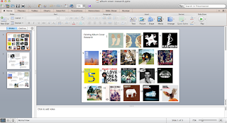
I have researched a few album covers which is one of my subsidiary texts. The album covers are all similar genres to Mahogany Drums.


This first album cover is by the Arctic Monkey. Black and white- very rock related colours, post modern. There is the band name, however there is no album name. I like the simplicity of just he artist name. Suggests you don’t need to know the album name because whatever the name a album by the Artic Monkeys will be good. May be seen as arrogance by the band.  Actor- we don’t know who he is, short hair and stubble compliments the cigarette and rebellious look, Very recognisable

Cigarette- the cigarette is a rebellious act, this is a genre related prop as artic monkeys are a very outspoken rock band it appeals to the audience, this is the image the band wants to portray.  

The next album is by a folk singer called Frank Turner. The album consists of three things, an image of the artist, the artist name and the album title. Large artist name and in red, makes you notice it a lot more. This could be because Frank Turner is not a hugely recognisable star yet and is hoping to get more recognised when people see his albumName of album is the majority of the cover. Frank Turner believes that people buy his album for the music. He wants to try and promote his album name. Having himself in the cover makes him more recognisable, it allows the audience to see his simplistic image. Having his instrument shows what type of music it could be. This is genre related as he is a folk and acoustic artist.


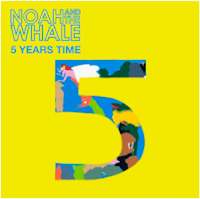
The next album is Noah and the Whale's an indie folk band. This album is very simple and to the point, it has the name of the artist, the album name and them an image of a big five in with a cartoon drawing inside. The colours are very eye catching, a bright yellow and blue. I think audiences like album images like this because of its simplicity and relevance to the title.


This album cover is by the Macabees. The band name and album name on the cover is written in a interest way, different to most other album covers, individual to the Maccabees. The location goes with the narrative of the name, given to the wild. The location is a in the middle of no where in the   bit of humour having a bee hive and their name being the Maccabees. Humour is a common trait of indie rock bands. 

This album is by the famous Oasis. Having the band in the album promotes them and shows their image, makes them more recognisableA very random image,  un related random objects. This suits the random and craziness of Oasis. Its also a common trait of indie rock bands to be individual and random. 


This is Bombay Bicycle Club's album cover. The name of album, small and in corner. The band may think they are most recognised by the theme of the album cover. The album artwork is the theme of their albums. It is cartoonish, very random, very unique to Bombay Bicycle Club. By choosing to do all of there albums like this is makes their albums very recognisable by their theme. 

What am I going to take from my research of Album Covers? 

Firstly I have decided to keep the Artist Logo or Font fixed. So in future albums and in all there advertisements there name is instantly recognised by the style. Below I have made a collection of artist names on some of my researched album cover as an example to what I mean.

Secondly I wanted my album cover image to be relative to the title or artist name. I had two options, I could either go with something random which is very genre related or something related. I choose related because I think the albums I researched which I thought looked the best were the ones with images related to either the artist or album name. I think when you look at an album with an un related image it is very confusing, which is not what I want for a potential customer to think when buying an unknown debut album.

I have chosen not to feature an image of my band members because I found with the album covers with artist imagery they tended to be very boring. If a person is not recognised like in my bands case you often wouldn't look twice. The Arctic Monkeys album did pull there random man in there image off because they are very well known by their name alone. I do believe that I should put some imagery of my band into my advertisement though because I need to show my audience who the band are, and I think the advert is more suitable to show who the artist is rather than a album cover.