I have researched a few album covers which is one of my subsidiary texts. The album covers are all similar genres to Mahogany Drums.
This first album cover is by the Arctic Monkey. Black
and white- very rock related colours, post modern. There is the band
name, however there is no album name. I like the simplicity of just he artist
name. Suggests you don’t need to know the album name because whatever the name
a album by the Artic Monkeys will be good. May be seen as arrogance by the band. Actor-
we don’t know who he is, short hair and stubble compliments the cigarette and
rebellious look, Very recognisable.
Cigarette-
the cigarette is a rebellious act, this is a genre related prop as artic
monkeys are a very outspoken rock band it appeals to the audience, this is the
image the band wants to portray.
The next album is by a folk singer called Frank Turner. The album consists of three things, an image of the artist, the artist name and the album title. Large
artist name and in red, makes you notice it a lot more. This could be because
Frank Turner is not a hugely recognisable star yet and is hoping to get more recognised when people see his album. Name
of album is the majority of the cover. Frank Turner believes that people buy
his album for the music. He wants to try and promote his album name. Having
himself in the cover makes him more recognisable, it allows the audience to see
his simplistic image. Having
his instrument shows what type of music it could be. This is genre related as
he is a folk and acoustic artist.
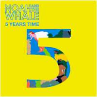
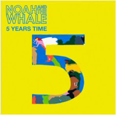
The next album is Noah and the Whale's an indie folk band. This album is very simple and to the point, it has the name of the artist, the album name and them an image of a big five in with a cartoon drawing inside. The colours are very eye catching, a bright yellow and blue. I think audiences like album images like this because of its simplicity and relevance to the title.
This album cover is by the Macabees. The
band name and album name on the cover is written in a interest way, different to most other
album covers, individual to the Maccabees. The
location goes with the narrative of the name, given to the wild. The location
is a in the middle of no where in the bit of humour having a bee hive and their name being the Maccabees. Humour is a
common trait of indie rock bands.
This album is by the famous Oasis. Having
the band in the album promotes them and shows their image, makes them more recognisable. A
very random image, un related random
objects. This suits the random and craziness of Oasis. Its also a common trait
of indie rock bands to be individual and random.
This is Bombay Bicycle Club's album cover. The name
of album, small and in corner. The band may think they are most recognised by
the theme of the album cover. The
album artwork is the theme of their albums. It is cartoonish, very random, very unique to Bombay Bicycle Club.
By choosing to do all of there albums like this is makes their albums very recognisable by their theme.
What am I going to take from my research of Album Covers?
Firstly I have decided to keep the Artist Logo or Font fixed. So in future albums and in all there advertisements there name is instantly recognised by the style. Below I have made a collection of artist names on some of my researched album cover as an example to what I mean.
Secondly I wanted my album cover image to be relative to the title or artist name. I had two options, I could either go with something random which is very genre related or something related. I choose related because I think the albums I researched which I thought looked the best were the ones with images related to either the artist or album name. I think when you look at an album with an un related image it is very confusing, which is not what I want for a potential customer to think when buying an unknown debut album.
I have chosen not to feature an image of my band members because I found with the album covers with artist imagery they tended to be very boring. If a person is not recognised like in my bands case you often wouldn't look twice. The Arctic Monkeys album did pull there random man in there image off because they are very well known by their name alone. I do believe that I should put some imagery of my band into my advertisement though because I need to show my audience who the band are, and I think the advert is more suitable to show who the artist is rather than a album cover.


